
~ UNSUNG COLOUR PAIRING HEROES ~
I recently came into possession of some pretty spectacular trousers, from LA-based label Staud. I like them so much I had to find an excuse to write about them. However, there is only so much one can say about a pair of pants – even when they are hot fuchsia, from a cool and affordable label, and make you feel like you are wearing a gently babbling brook over your legs.
Staud’s 2017 Resort collection, from whence my pants came, seemed heavily focused on the ‘clashing’ pink-red combination. It’s a romantic coupling which somehow manages a perfect equilibrium between feminine and ‘edgy’.
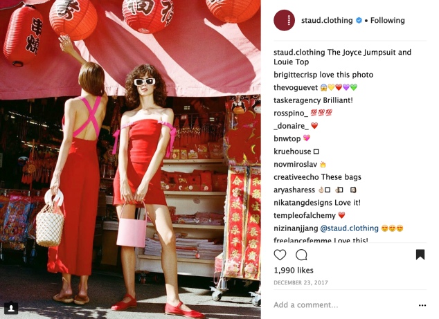
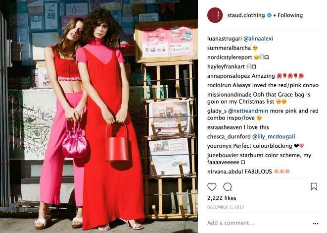


This colour marriage was a common theme channeled by many fashion houses throughout 2017 [Oscar de la Renta, Attico, and Valentino to name some of the bigger labels], as well as the influencers who wear them so well. Even though pink and red could be considered a colour clash, if a paler pink is paired with the right red it can also be seen as tonal blocking – pink being a paler shade of red.
Recently it’s been all about tonal blocking – making one colour the star of the show. But what about a meaningful duet? What about colour combinations are out there (like the bolder pinks with red) that work because they almost don’t work? I decided to see if two is really better than one, by pairing colours of the rainbow into my outfits. But how to select which two hues to go together? I took a leaf out of Mother Nature’s book – if it works in the natural world then surely it should be able to work in my wardrobe!
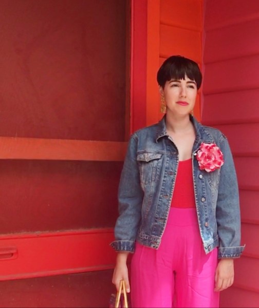
PINK + RED
I was first exposed to this ‘unholy alliance’ in my teens while watching season six of Sex and the City. Samantha Jones strutted down the street, chatting with Carrie, wearing a hot pink blazer with deep red trousers. The scene wasn’t that remarkable but that colour mixing was!
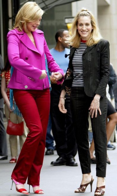
Even then Samantha’s outfit really resonated with me.
I had to fight my hot thoughts and warm feelings towards the pink-red duet because I was in a phase where everything I wore had to match – shoes, handbag, belt etc. To my early millennial budding-fashionista self, colour clashing simply looked like you put no time or effort into your outfit. Fifteen years on, I still remember that jacket and pant union but, luckily, my emotions now feel validated.
As I mentioned previously, I think red and pink work well together because the pairing maintains a balance between looking soft and feminine while also looking strong and bold (just how us women can be both at once!).
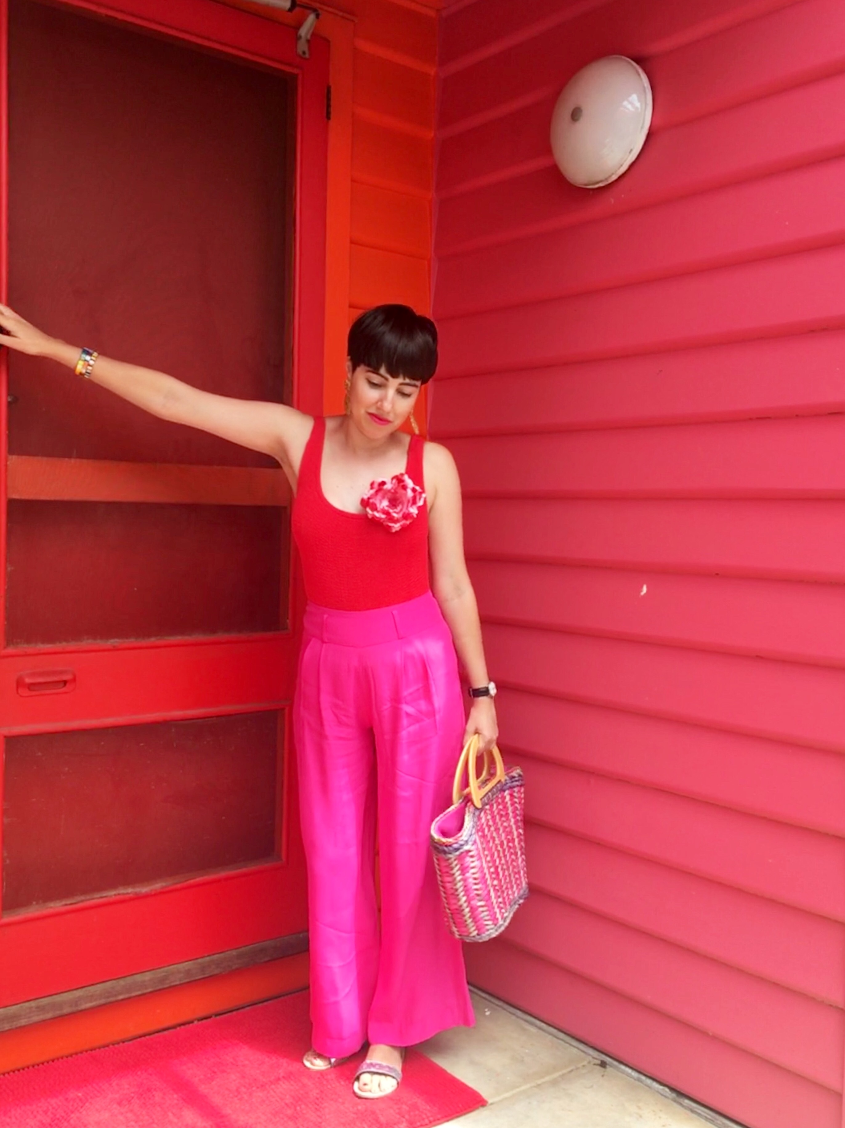
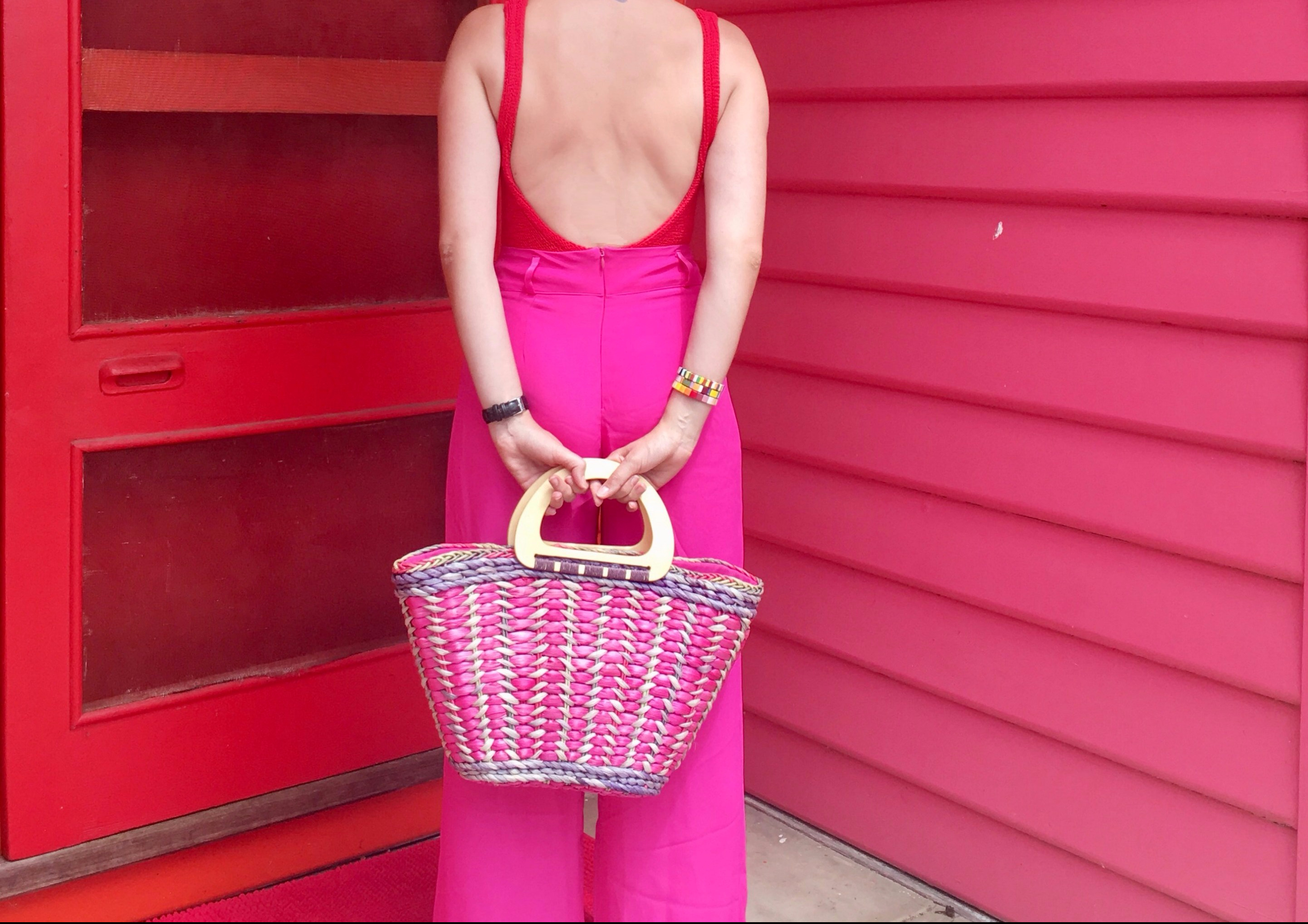

Pink and red also work well in nature. Think of some of the most spectacular sunsets you’ve ever seen, brazen ribbons of red and pink slashing through the glowing blue-black backdrop of the sky. And a pink and red rose, by any other name, would still look as sweet.


For this outfit I tried to remain a purist in two-tonal blocking, so as not to water down the vibrant colour combination, therefore keeping any other colour additions to a minimum.
BLUE + GREEN
Who the hell said “blue and green can never be seen”?


This has been one of my favourite colour combinations for a long time. Two cool tones together, this colour partnership exudes a certain calmness and freshness. Maybe this is largely because we find these hues in natures basic colour palette? Mother Nature’s ‘go to’ outfit would most definitely contain blue and green!
You will find these two colours residing serenely together where any sky holds bright above the trees and where any forest or jungle meets the water. If you look at a world globe, it’s basically all blue and green.


This ensemble ended up being less about blocking out blue and green and more about combining three items of clothing which already contained that colour pairing(four, if you include my socks). Colour blocking on colour blocking on colour blocking? Sounds a bit meta? What I thought made this look work were the different textures: satiny silk, mixed with soft cotton, mixed with rough wool.
ORANGE + GREEN
There are seven colours in the rainbow, which is an odd number, so in order to represent the full set, one colour had to be used twice. I chose green because it’s a recent favourite of mine and one I was keen to experiment with.
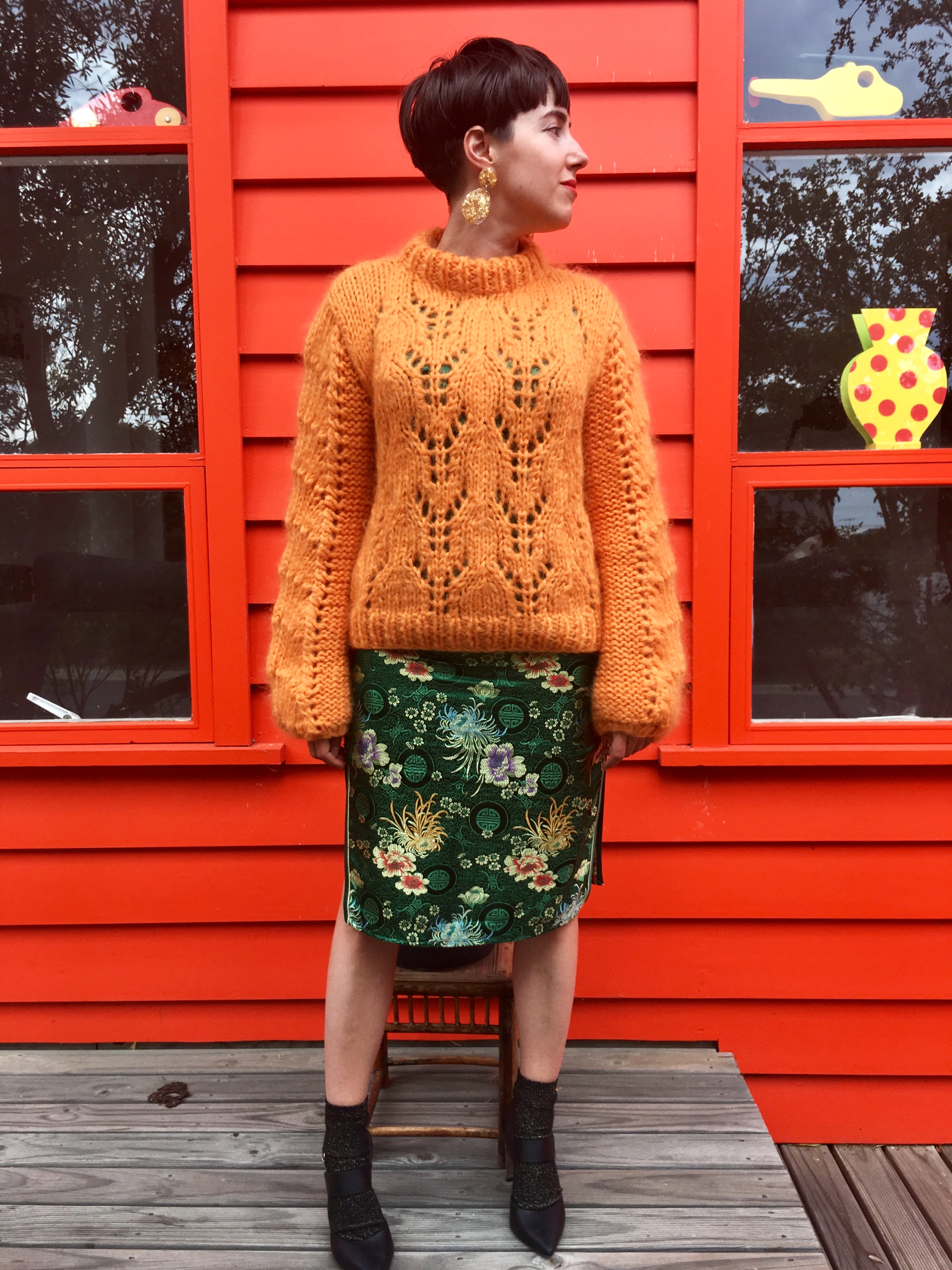


Orange and green reminds me of my favourite time of year: the beginning of Autumn. The trees are adorned with leaves a mixture of the two colours, one typifying a beginning and one representing things coming to an end – once again leading back to that theme of ‘balance’. You’ll also find orange and green in a balanced diet!


I felt like this outfit verged on being too busy, however the orange in the dress itself helped tie everything together. When pairing quite disparate colours it’s generally best to keep patterns and extra detailing to a minimum.
PURPLE + YELLOW
I will admit I was kind of left with these two colours after all the other shades buddied up. It was the hardest one to curate as I currently have limited purple and yellow items in my wardrobe. So I kept it simple by using a yellow base with purple accessories and lipstick (the purse is probably a pencil case).


Partnering up purple and yellow made me realise how much energy these two colours create together. Maybe that’s why the LA Lakers chose it as their team colours? 😉 In nature my mind obviously went straight to the velvety violet, named after its very colour, with a golden centre. Moving off land and into the ocean there is the vibrant Royal Gramma (I don’t understand how it looks so grumpy when it has scales of those colours).


Whether it’s Sonny and Cher, Diana Ross and Lionel Richie, or Nelly and Kelly (Rowland), when staging a tonal duet it’s important to remember your supporting acts! Neutral colours and materials such as denim, black, gold and silver help keep the focus where it’s wanted but can also aid in taking the edge off, if the spotlight starts to shine a little too bright.
Honourable mentions go to: blue + pink; orange + blue; purple + green; yellow + orange.
